Project Lead | Visual Design | UX Design | Movement & Brand Design | Copywriting

Project Overview
Brooklyn-based filmmaker and designer Maple Shipp wanted to reimagine her portfolio to better reflect her diverse skill set and evolving creative style.
As a multi-disciplinary video creative, Maple sought a site that would showcase her motion design, editing, and branding expertise while leaving a lasting visual impression. The goal was to transform her minimal, outdated site into a visually compelling and movement-centered portfolio that would attract collaborators, clients, and recruiters, and support her aspirations of producing independent films. Along the way, we also incorporated her blog and newsletter to enhance her personal brand and connection with her audience.
Role & Responsibilities
Project Lead | Visual Design | UX Design | Movement & Brand Design | Copywriting | Client Communications
I was responsible for the project’s visual design, user flow analysis, website design, brand development, and multimedia editing. This included curating and optimizing Maple’s content, creating gifs and stills from her video and editing work, ensuring the site’s accessibility, and balancing aesthetic choices with functionality.
Project Scope
This was a full rewrite of Maple’s portfolio, including transferring the site to a new hosting platform and creating custom GIFs, stills, and optimized videos from her work.
Accessibility was a priority, with careful attention to color contrasts and font readability. Inspired by the Frans Hals Museum, we prioritized bold, visually striking aesthetics over SEO or strict performance requirements while ensuring usability across all devices.
The Challenge
The goal of this project was to transform an outdated, minimal portfolio into a bold and unique showcase of the client’s skills in motion, brand design, and editing.
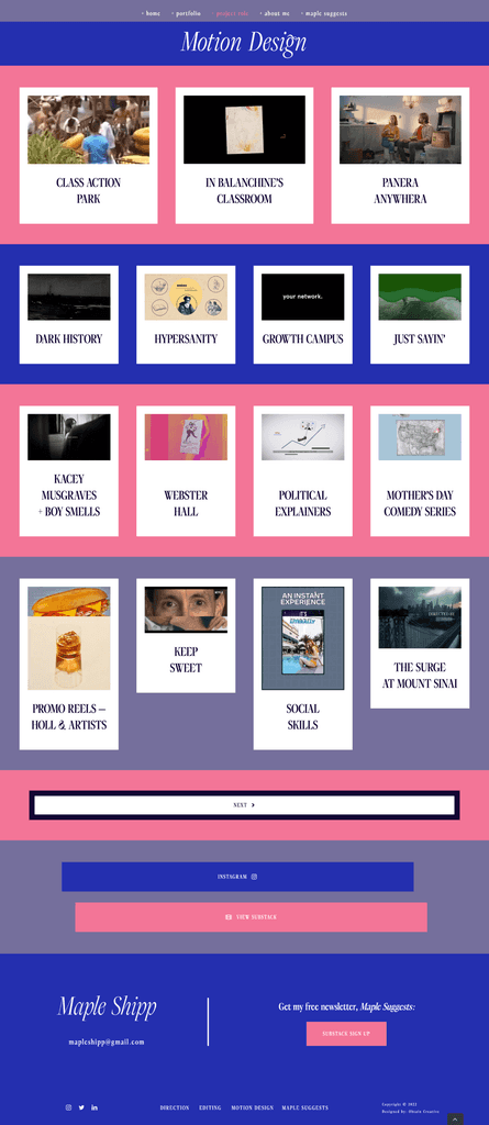
Maple’s old site organized projects by genre, making it hard to showcase her full skill set. Our goal was to create a unique, memorable portfolio that balanced playful creativity with professional polish, moving beyond typical film motifs to highlight her personality and expertise. While SEO and performance weren’t priorities, we focused on smooth functionality, accessibility, and effectively displaying her video-heavy content across devices.
Users & Audience
We designed the site to resonate with three key audiences:
Brands, clients, and marketing directors who needed a lasting visual impression and a clear understanding of the scope of Maple's work.
Recruiters looking for quick proof of her skills and social proof through recognizable clients.
Fellow filmmakers, editors, and art directors who might find her blog inspiring or want to collaborate directly.
The Process
1. Research & Concept Development
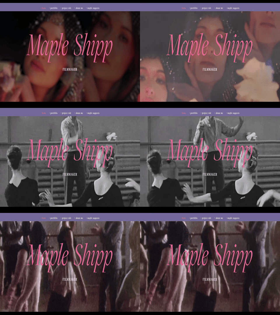
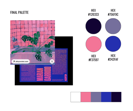
We began by analyzing the portfolio sites of independent filmmakers, potential collaborators, and media agencies to understand what would resonate with Maple’s audience. Drawing from Maple’s vision, our first design concept featured a calm, introspective look inspired by “an ocean on a foggy day.” After client feedback, we pivoted to a bolder, more dynamic design inspired by the Frans Hals Museum. This direction featured strong color blocking, dramatic typography, and movement-driven visuals.
2. Content Curation & Design Implementation
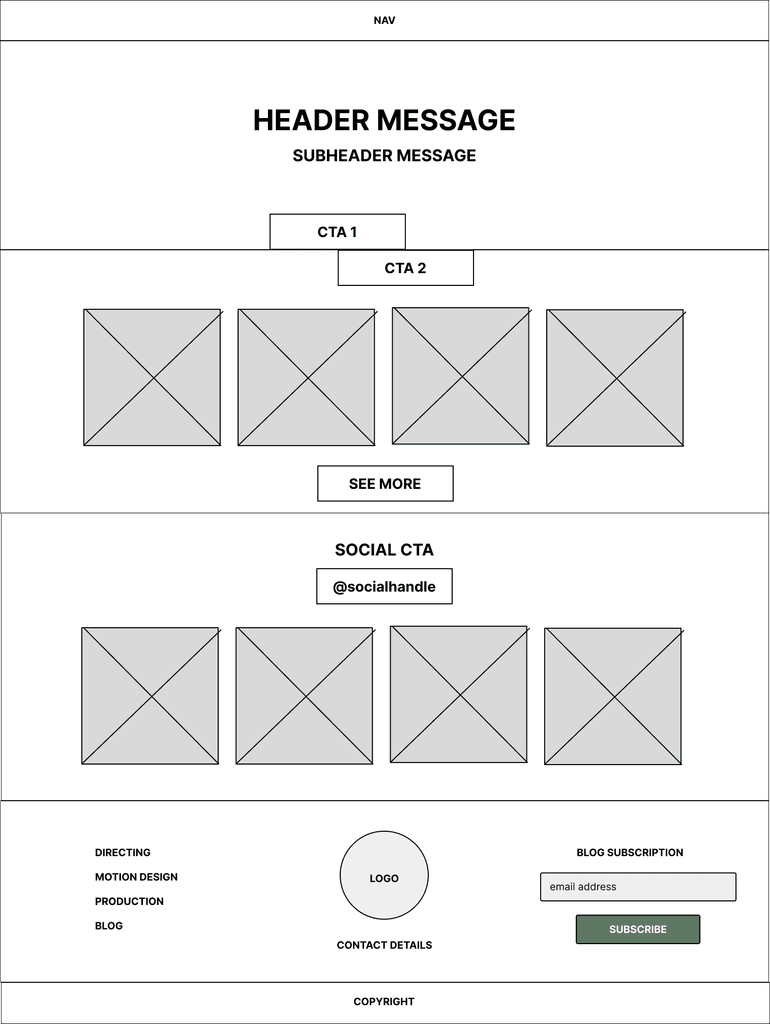
I worked closely with Maple to gather and organize her work into categories, creating GIFs and stills for each project and optimizing video files for smooth playback. We built a user-friendly site structure, integrating personal touches like her blog and newsletter to show her personality and creative voice. We also refined the visual hierarchy with a homepage sizzle reel, recognizable client logos, and animated elements to emphasize her unique contributions.
3. Testing & Iteration
Throughout the project, we experimented with multiple palettes, typography options, and layout variations. Accessibility and usability were tested at every stage, including feedback from a colorblind user to ensure the palette worked for everyone. We balanced bold aesthetics with performance optimization for smooth functionality across devices.
4. Client Empowerment
Once the site was finalized, I provided Maple with a thorough training session on managing and updating her portfolio. This ensured she could confidently maintain her online presence and make future updates independently.
Outcome & Insights
The final portfolio is a bold, movement-centered design that highlights Maple’s creativity and versatility.
It creates a lasting impression on collaborators and clients while reflecting her evolving artistic voice.
Key takeaways from the project include:
Visual impact vs. longevity: Bold, striking choices stand out but may require regular refreshing to stay relevant.
Managing collaboration: Setting clear expectations around feedback and iteration rounds is essential for resource efficiency.
Balancing usability and creativity: Accessible, well-optimized designs can still push creative boundaries.
Maple’s new portfolio not only celebrates her work but also sets her up for exciting opportunities in her career as an independent filmmaker and designer.


